
CONTEXTS
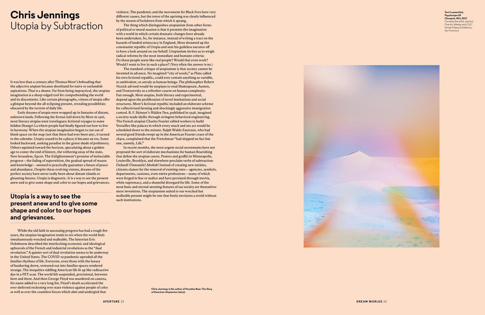
I found this article in Aperture Magazine and was intrigued by the title and the image it contained. The idea of applied utopia had never occurred to me when it comes to my practice, so I was interested in the potential of encountering connections. The colors of the article page were degraded in shades of warm pastel tones.
The associated traits in the fading of superstition as a principle interested me. “Utopia is invisible. Utopia is a diagnostic, a way to see the present anew to give shape and color to our hopes and grievances. The utopian imagination tends to stir when the world feels simultaneously wrecked and malleable.” I relate to utopianism with the political detachment associated with the word.
The piece I worked on intends to discuss the utopian idea of being able to access all wavelengths of light, to see through the walls, to inhabit thresholds. Utopia presents the demands not only as a society but regarding the way we are built. We have to be as perfect as the society and places we inhabit. So artificial intelligence, regarding image making, presents in a way a more accurate version of an image of humankind, to see ourselves. How much responds to us, and how much is self-taught?
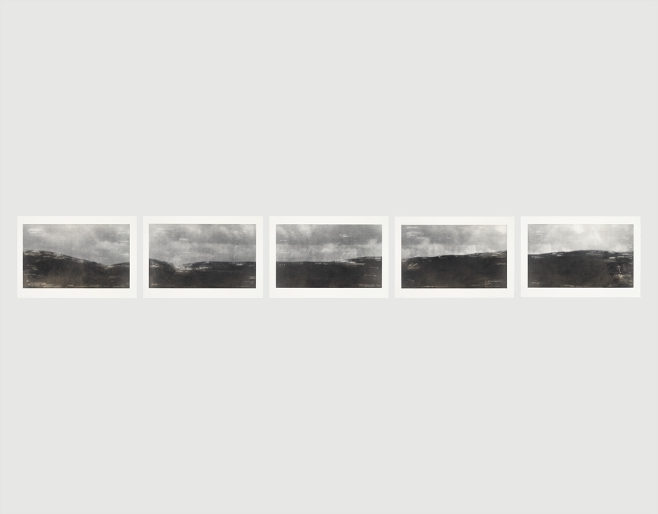
Tacita Dean is great to explore different ways of displaying visual work. For the piece shown below, Blind Pan, from 2014, Dean takes five images and places them one next to each other in a fixed horizontal line. The images are landscapes with chalk words written on top. The order on which the images are displayed make them seem like stills of an unmade film (Borch, 2004).
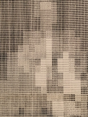
The piece I showed in Dilston intended to place the pieces in an order that responded to a sequence, however, not enough information is provided to develop a whole narrative. The first image sets up a landscape with a malformed center, as distorted humans begin to make an appearance and get accessorized, as well as distorted. The word reality is placed in the title of the piece to guide the spectator into the key concept that was used to generate them.
This piece questions the passing of time and images as stills from a bigger picture. The notes seem to freeze time in order to expand the meanings and orientate regarding what is being thought about. There is an interesting transition in the way the black horizon expands the view. It seems to go down and then back up again, where the sky is clearer. The use of spacing helps to create a narrative and a cohesive storytelling.
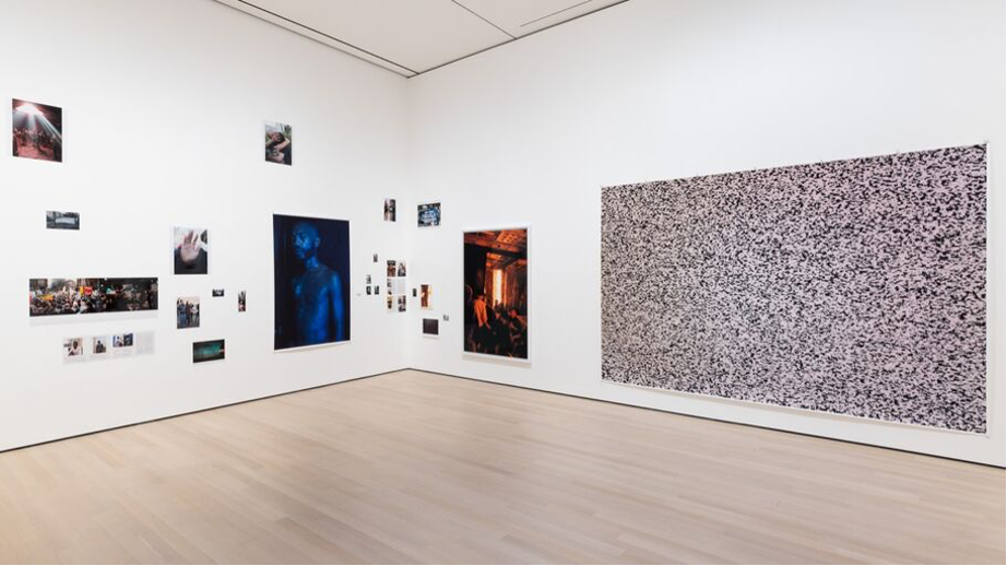
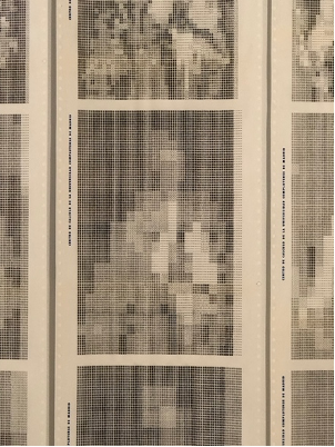
At MoMA, Wolfgang Tillman’s retrospective exhibition shows images of different sizes on the walls that seem scattered, while being fixed. Beyond the question of if this makes it work successfully or not in that specific order, I believe it is interesting to think about how order changes meaning and affects the interaction one has with the piece. Pierre Huyghe has a similar visual layout in book printed content. He states that the displays attempt to recreate the space within a gallery, where there is no correct order to transit it.
These are similar questions to the ones asked when generating different artificial imaging and attempting to interpret them in an external context. Traditional photographic prints generally don’t allow direct interaction, which is what I wanted to challenge in my most recent project.
Another important artist for my practice is Martina Dal Brollo, an Italian artist who uses light polarization to focus on climate change, environmental pollution, landscape and plastic waste. Her project Inner Landscape shows a delimited threshold to alter the perceived color embedded in plastic waste. Different molecular stress and material density generates overlays in different shifting colorations. (Dal Brollo, 2022)
The light polarizer is also an interactive piece where light orientation can be altered by the audience. In comparison to my piece, I believe Dal Brollo has a more materialistic approach, while I am shaping figurative traces using the molecular stress that is now visible. I believe a more specular, hauntological and futuristic approach can also help show the potential of that same material and perceptual effects to create unfamiliar images. I also like the fact that there is not so much distance between the polarizers and the actual piece being polarized, as I believe it helps to reduce a potential detachment.
I think that understanding the reasoning behind why light polarization is being used instead of other processes is crucial to having a complete conceptual framework on how to access the spectator’s point of view impactfully. The environmental point of view, however, has helped me revise how I could use plastic waste to sculpt photographic or AI imaging onto these already used materials.
Martina Dal Brollo, Inner Landscale (2020)
Daisuke Yokota’s Untitled pieces are photographic work focused on the transformative processes of image distortion. While his approach is chemical, I am interested on how an image can become another, and then another. Every step in the image altering process can be interpreted as gesture charged with meaning, or intent. The options are endless, so the question of where to stop the process is raised.
In an interview held by Annabel Fernandes for Purple Magazine Issue 25 she asks him “Can you tell me about your process?”, his answer was:
“First, I take a picture with my digital compact camera. Then I re-photograph the same image, which was printed out from an inkjet / laser printer, with a film camera. When I develop that film, I use boiling water. That makes all the emulsions melt, silvers rust, and new colors emerge. Those damaged films can no longer be developed in the darkroom, so I scan them with a scanner, like you do with your documents. And that scanned image will be overlapped on the original picture taken by the digital camera in the first step. This process is repeated a number of times to create the final images.”
(Fernandes, 2022)
So, this ongoing number of questions and decisions are embedded in the final piece, even when they are not even recognizable. Sometimes a decision that was not taken can also be fundamental to interpret the final piece. The colors, the scratches, the chemical incompatibility are all focused on this idea of image processing. The idea of control comes to play regarding what and how much is happening.
Daisuke Yokota, Untitled (2014)
Gabriel Dawe does site specific installations of thread gradients in various spacious spaces. The thread tends to shape figures with colors in a distribution similar to heat maps. These gradients shift as you walk around the space, so the interaction between the large-scale object and how you react is directly embedded in the experience and how the piece is interpreted.
His piece Plexus Nº14 from 2013, however, is different but particularly interesting as it comes across more as an object-piece. It contains numerous groups of thread that seem to be trapped in an acrylic cube. In the same way that the thread installations work, the spectator will discover new aspects of the piece as they move around it and explore the display of each side.
Some pieces are placed on the wall and others on plinths so, for example, one asks from the audience to lean down in order to see the bottom side, while the other needs you to walk around it. The way in which the information is revealed will affect the physical manner in which the piece is approached.
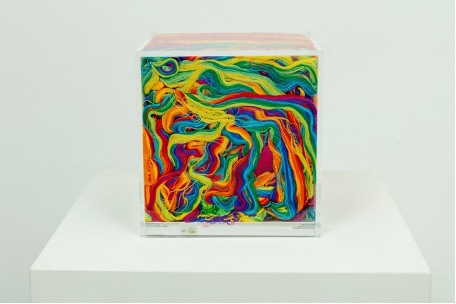
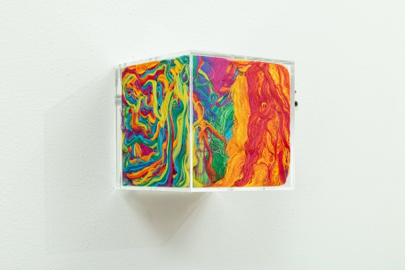
Gabriel Dawe, Plexus Nº14 (2013)
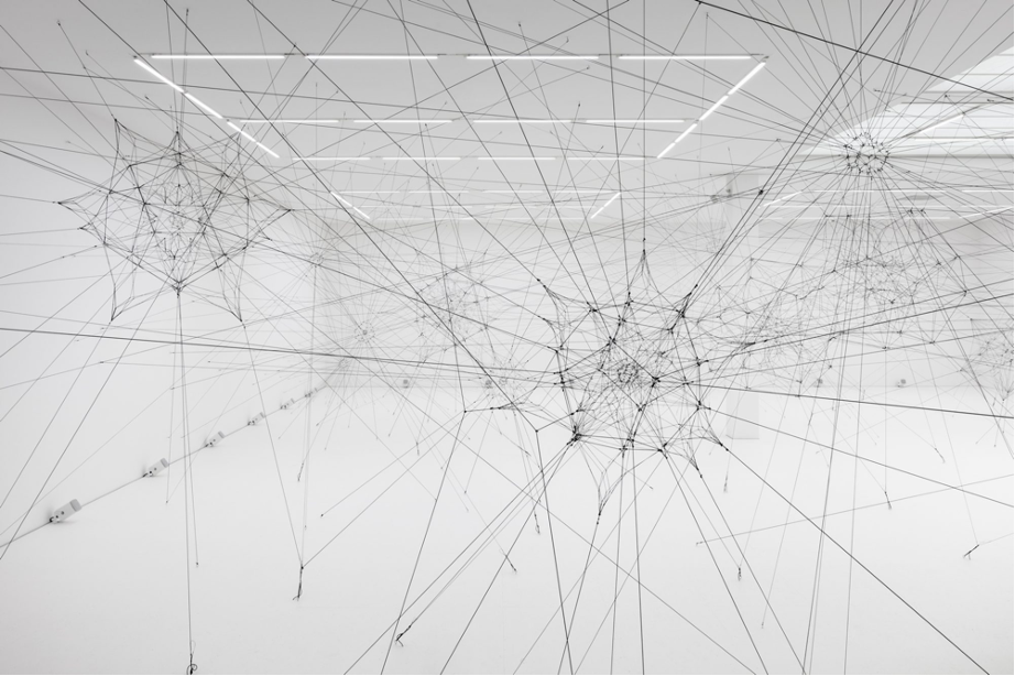
Tomas Saraceno is an Argentinian artist and architect who reinforces the idea of art as an experience. He was interested in the way in which insects, and spiders in particular, would inhabit space. He aims to challenge people’s different fears and how they are shaped. There is an underlying interest for the relationship between human and non-human worlds of conception. To accomplish this, he builds, for example, site-specific webs, so humans can experience moving through space in a different way.
He creates interactive installations, floating sculptures and community projects to propose equitable ways to inhabit the planet. He places his work in a post-fuel era, so they tend to be fueled by renewable energy. In his exhibition “Algo-r(h)i(y)thms” at Esther Schipper gallery in Berlin, he showed a site-specific installation of a web of cable that formed an instrument that interconnected the gallery through different signals.
These installation mimics the way in which spiders communicate with each other and even send deceiving signals to disguise as ants to confuse their prey. By understanding other forms of being, we can discover other ways to communicate and interact with our surroundings. This installation challenges the limits of architecture by discussing the acoustic properties of an interconnected sculpture. This piece reflects on signal interconnectivity in the same way I intend to focus on human visual perception altering. The idea is to try to find different modes of existence through the exploration of systems of interconnection.
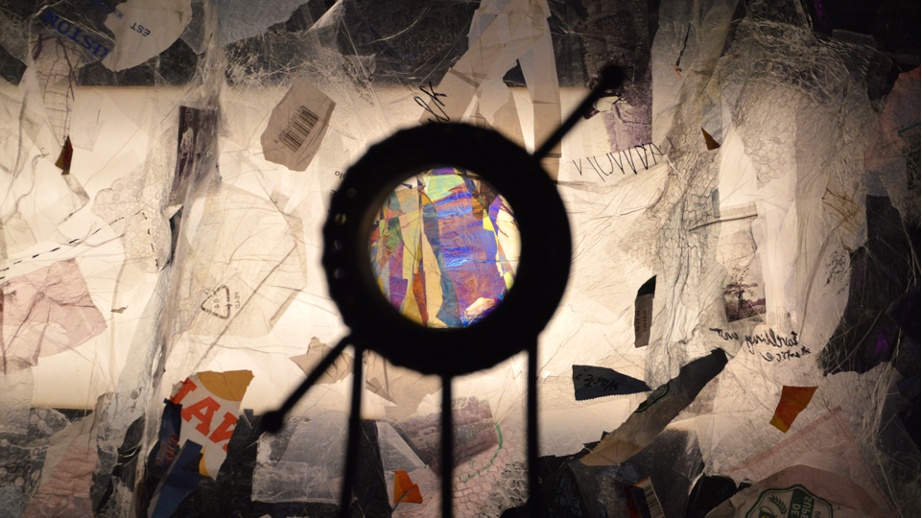
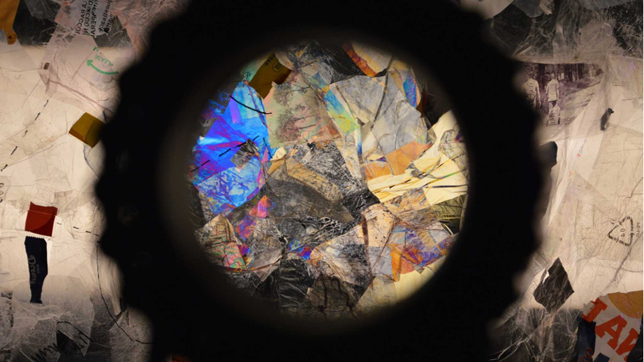
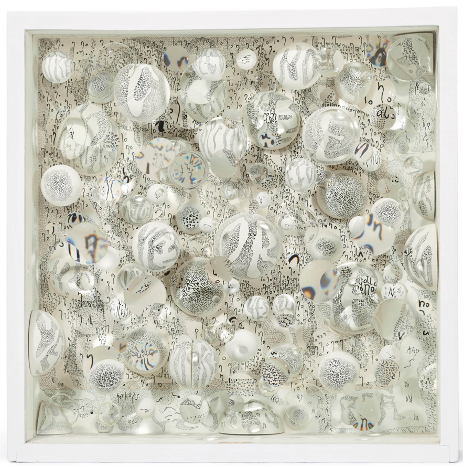
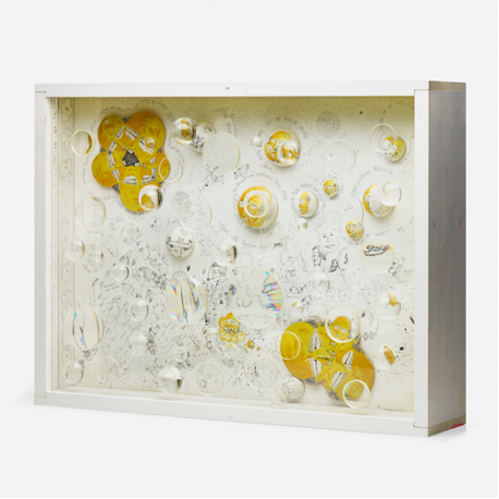
Mary Bausermeister is a German post-war artist who made pieces with different sizes of glass lenses onto wooden boxes. The pieces present a distortion generated from different angles to look at the piece from, as well as a color spectrum effect that seems to escape from the figures. These colorful ghostly figures that appear around the ink drawings are a visual effect generated by the distance in relation to the observed piece and the spectator due to anamorphosis and deformation.
In the sixties, Bausermeister was particularly interested in multiple glass lenses of different sizes to examine ink engraved onto wood constructed with lithograph. The main question to be answered at the time, as expressed in an article by Artforum about Bausermeister’s work was how to imagine the artwork beyond the discrete material object. (Harren, 2011) Bausermeister was also interested in the interconnection between different art disciplines such as music, theater and fine art.
The action of peeping in order to access one or many filtered versions of what is shown questions the way in which lenses or filters can fully change the approach we have towards an object or reality. Also, where the art object is placed in space in relation to the world, and how contained it really is, still remains an open discussion. She is known for being related to the Fluxus movement, prioritizing the artwork process over the finished product.
Camille Dutoit’s Eclipse sculpture can be rotated to affect how reflective the surface is. Eclipse places itself in the middle between a figurative and a functional object. Eclipse allows the person to measure the intensity of their own reflection due to an effect generated placing a surface with a colored gradient from an intense dark to reach full transparency.
The object seeks to place an interplay between reflection and transparency. “When the gradient disc is turned upwards, the reflective surface of the first disc is equal to 20 percent. But when the gradient disc is turned downwards, the reflective surface of the first disc becomes almost 100 percent” (Dutoit, 2022).
This piece is similar to mine. They both conceive light perception as linear grids that can be turned in order to generate perceptual effects like diminishing the reflection or showing molecular stress. The objects are devices that shift and don’t present a singular version. They are designed to shift a singular point of view and reveal different coexisting versions of the surfaces and the realties they reflect.
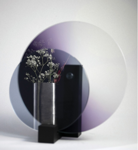
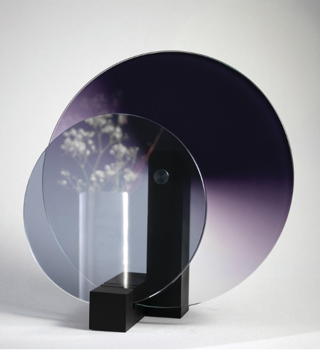
Camille Dutoit, Eclipse (2022)
Regine Schumann is a German light artist based in Cologne. Her body of work from 2019 was very important for my research. Since light is the main subject of interest, the question regarding where the image is, is raised. The piece of art goes beyond the object and responds more to a material reacting perceptually to its given light conditions. She tends to do light sculptures, however the one I will talk about just sat on the wall.
I encountered the sculpture by Schumann in the Kunsthal Rotterdam Art Museum which inspired some potential changes to the piece I currently presented at Dilston. The relationship between materiality and color shift is central to the elaboration of the pieces. These squared acrylic boxes shift depending on if the light is set to ultraviolet or regular daylight. The piece will be activated differently with no right or wrong version, both coexist.
I find this interconnectivity between how the material naturally reacts and the light context in which the piece is shown very interesting. The object exists unaltered on its own, however the luminary context shifts how certain areas and different colorations are perceived. The way in which the glass is crossed on top of the iridescent plastic allows a space for reflections to occur, which changes the color and distorts the surroundings of the inhabited space.
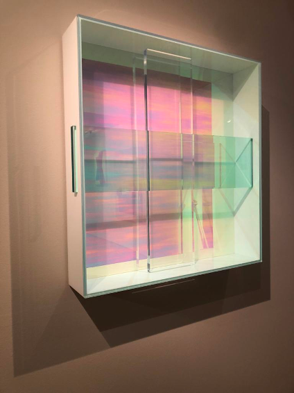
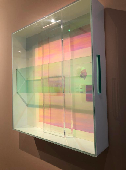
Regine Schumann, Untitled (2019)
Ignacio Gomez de Liaño (madrid 1946) and Guillermo Searle’s Painting and Perceptronics, Study of transformation in Painting (“The Apostolate” by El Greco) was a piece I encountered in the Reina Sofía Museum in Madrid. The piece dates from 1970/1971 with a paper reproduction from 2021. These perceptronic studies interpreted the different gradients of color as symbols that would scatter around the print.
This way, by getting closer or further away the perception we would have of the prints and the figures depicted would change. On one side, getting closer allowed you to identify the repeated symbols that conformed the image, however by getting away from it, the figurative subjects would emerge and it would be easier to identify what or who the figures were.
The idea behind this piece was to analyze visual outcomes as language, interpreting color and shape as code. Their interest was to analyze the moment in which the apostle’s figures would stop being recognizable, to understand recognition as a process with levels and not a fixed figurative form. There is a search for understanding the neutralized image, and the least minimum stage in which it is still recognizable without a figurative allusion.
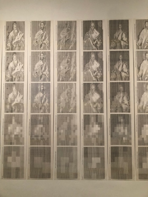
Ignacio Gomez de Liaño and Guillermo Searle, Pintura y perceptrónica. Estudio de transformaciones en pintura ("El apostolado" de El Greco) - 1970 - 1971 / 2021 . Museo Reina Sofia
Junior Fritz Jacquet is a French artist who specializes in Origami. I encountered his piece “Caldera (wall lamp)” in the Origami Museum of Zaragoza. This piece is made with organic paper, and then folded and sculpted. The three-dimensional aspect of it reminded me of the light polarization pieces, which have a unique enhanced perspective from the front but reveal the transparent surfaces when looked at from the side.
When looking at the center of Fritz’s light sculpture from the front, it is difficult to distinguish if the material is shaped inwards or outwards. This confusing approximation to the material aspect shows the potential of using backlight and surfaces with transparencies when showing structural three-dimensional work.
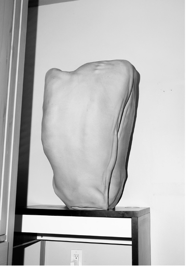
The scale of the piece, as well as how the paper was folded to seem like it was holding onto the edges, depicts the use of gesture and repetition as a way of embedding human aspects to the piece. For my central piece the print was not correctly printed on the edges, so I filled the edges with clay before vacuuming it. The gestures of the pressure applied by fingerprints become a physical remain and distinctive aspect of the piece.
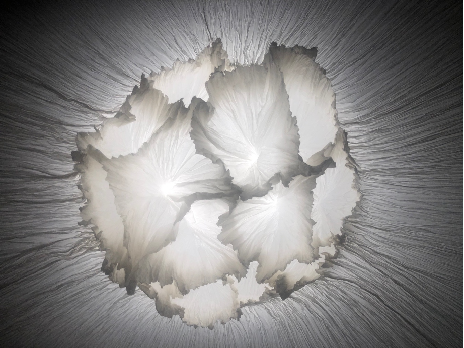
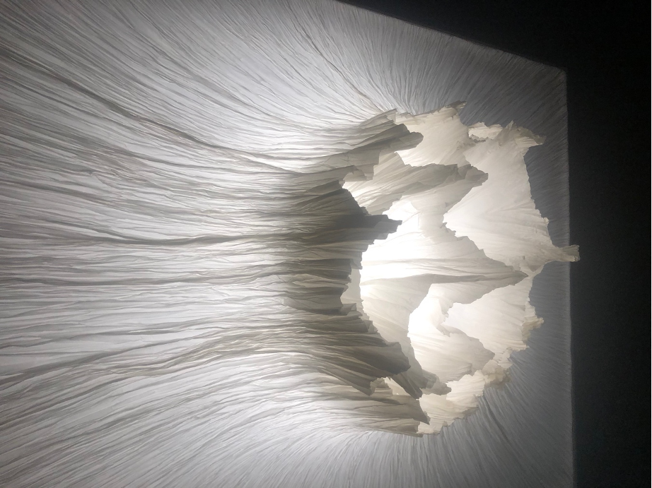
Junior Fritz Jacquet, Caldera (2020)
Yunchul Kim’s pieces for 2022’s Venice Bienalle were a huge inspiration for this unit’s work. The combination of perceptual aspects as well as the architectural design and mechanic engineering is a constant reminder of how technique is a crucial aspect in artwork making. Yunchul Kim’s approach to making is also interesting, as he is also drawn by material potential, interaction and human perception.
I also like the speculative aspect of the design, how it challenges futurities and the way there is an expectation built from the spectator when looking at these very complex mechanical systems. The piece Chroma V is focused on kinetic movement mechanically altering the stress on an atomic level. He uses polarizers to show this.
There is an aesthetic in the machine that comes from the design, which starts shaping the way in which the piece is then interpreted. He uses the figure of nods to talk about the configuration of the universe, and multiple dimensions in a speculative manner. He also reflects upon how ambiental and mechanical noise play an important role in perceiving the passage of time, so this also becomes a part of the piece. (Nair, 2022)
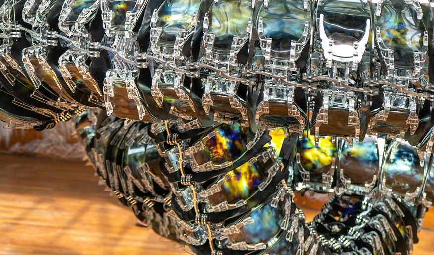
Yunchul Kim , Chroma III (2020)
I encountered Asger Carlsen’s work at the ‘Unseen’ exhibition in Amsterdam. The first image appeared untitled. I have now gotten more familiar with his other work. I am interested in Carsen’s background as I find interesting that he began his career as a photojournalist and crime-scene photographer (Carlsen, 2022).
I wanted to understand why I was so interested in his work, and somehow that friction has made me look more into what is shown in the pictures. I find the raw aspect of black and white flash photography interventions fascinating when the texture is so uniform, and shows a close, fixed, and secured version of what is being depicted. They are mutilated, yet fixed and sealed. They present organic skin, but there is no one present, and yet the flash reminds us of the spectator’s eye, ourselves.
This back-and-forth conversation, almost like a monologue, is a constant. His photography is also a reminder of how I am seeing black and white photography thanks to my most recent project. I can imagine these images vacuumed sealed using a ‘darker is higher’ setting, having the borders where shadows are high, while the light reflected from the flash have a low altitude. They would be vacuum sealed like the images themselves. Maybe the process could also depict details like the light socket, or the small cavity generated by the flash bouncing back from the table in the second image, or maybe they would be lost in the process elevating the material’s stress over what is shown.
Finally, I encountered an interesting relationship between AI generated images and very sharp and well executed shape corrections. This auto correction is also present in AI, where objects with no apparent initial connection get together to form shapes that at the same time create meaning. Both depict inexistant objects, surreal pieces that seem to make sense and belong in the universes context they are presented in.
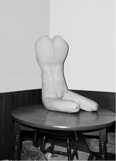
Asger Carlsen , Hester (2012)
Mariko Mori is a Japanese artist interested in the universality of visual language. Mori explores futurism and cyborg-figures to make social criticism and reflect back on society. Considering humans as part of nature, she has an interest in questioning the boundaries between technology and spirituality speculating about temporality using other worldly figures.
Mori explores different media such as photography, sculpture, installation and performance, however I am interested in a series she made for the show Miracle (2001). The piece is made by eight cibachrome prints, diachronic glass, salt, and crystals. The piece’s subject is the life of stars shown as a process. She uses prehistorical remains to inspire the shapes and figures and talk about the begging on new life.
In spite of functioning as light prints, I was interested in how the tinted glass interacted with the LED lights to separate the images from the walls. The circular frames are inspired by hyper-real technicolor skies that help provide lively attributes to the images. Despite the criticism the pieces received, Mori is an interesting reference as she plays with light to enhance the images she is showing, while at the same time constraining them to a narrative. I also find several aesthetic connections in relation to the subjects she wants to address (Mori, 2012).
Mous Lamrabat had a show in Amsterdam at Foam where he showed vacuumed cultural , transnational symbols onto prints. These images had a direct conversation between what was being depicted in the image in relation to what was embedded on the print.
He uses symbology to refer to identity and social construct and universality. Logos of mainstream brands may appear vacuumed or in patterns worn by the subjects being portrayed. Subject identity construction is challenged as seemingly universal and social criticism arises as a way to deconstruct privilege.
Mous Lamrabat challenges the viewer’s definition of normal with images that can be interpreted on their own or as groups of images. The vacuum form print allows the spectator to read two simultaneous images at once. I would find fascinating to do a vacuum of the same two-dimensional mapped image printed on top.
To enter a section of the exhibition everyone had to take their shoes off as there was a carpet with a print designed by Lamrabat, thus reflecting on universality. The subjects are placed in natural surroundings wearing different brands and logos with a very detailed lighting scheme. The images I am showing also place subjects in similar compositions, however the distortions are perceived as height, texture, light and color.
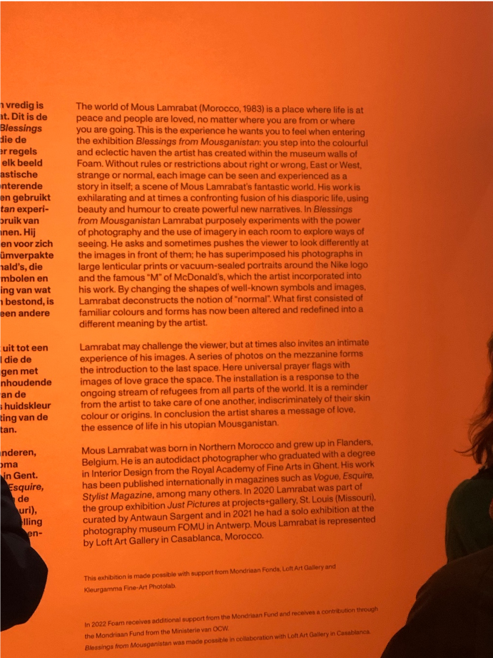
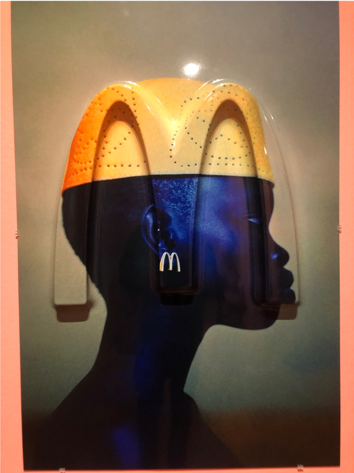
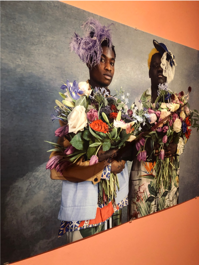
Mous Lamrabat, Blessings from Mousganistan (2022)
CONTEXTS BIBLIOGRAPHY
BORCH. (n.d.). Tacita Dean, Blind pan, 2004. Tacita Dean | Blind Pan, 2004 | BORCH Editions. Retrieved October 31, 2022, from https://borcheditions.com/product/blind-pan-tad-04-001-1/
Carlsen, A. (2022). Asger Carlsen. Retrieved November 5, 2022, from http://www.asgercarlsen.com/0t5l1evfrre974s76km1mz7bf2fmou
Dal Brollo , M. (2021, November 2). Inner landscape. Martina Dal Brollo. Retrieved November 2, 2022, from http://www.martinadalbrollo.com/inner-landscape/
Dawe, G. (2013). Plexus no. 14. Gabriel Dawe + Visual Artist. Retrieved November 2, 2022, from https://www.gabrieldawe.com/plexus-no-14
Dutoit, C. (n.d.). Eclipse. Camille Dutoit. Retrieved November 2, 2022, from https://www.camilledutoit.com/productdesign/eclipse
Fernandes, A. (2021, March 9). Daisuke Yokota – Purple Magazine. Purple. Retrieved November 2, 2022, from https://purple.fr/magazine/ss-2016-issue-25/daisuke-yokota/
Goodman, E. (2022, September 23). At moma, Wolfgang Tillmans reflects on his decades-long career without fear. Artsy. Retrieved November 1, 2022, from https://www.artsy.net/article/artsy-editorial-moma-wolfgang-tillmans-reflects-decades-long-career-fear
Harren, N. (2011, January 4). “worlds in a box: Mary Bauermeister and the Experimental Art of the Sixties” at Wilhelm-Hack-Museum. The online edition of Artforum International Magazine. Retrieved November 2, 2022, from https://www.artforum.com/picks/worlds-in-a-box-mary-bauermeister-and-the-experimental-art-of-the-sixties-27263
Jennings, C. (n.d.). Utopia by subtraction: Aperture: Winter 2020. Aperture. Retrieved October 31, 2022, from https://issues.aperture.org/article/2020/4/4/utopia-by-subtraction
Lamrabat, M. (n.d.). The portfolio of photographer Mous Lamrabat. MOUSMOUS. Retrieved November 2, 2022, from https://mousmous.com/
Nair, S. (2022, July 10). Stirring dreams: Visual artist Yunchul Kim Presents ‘gyre’ at Venice Art Biennale. STIRworld. Retrieved November 2, 2022, from https://www.stirworld.com/see-features-stirring-dreams-visual-artist-yunchul-kim-presents-gyre-at-venice-art-biennale
Mori, M. (2012). Mariko Mori: Exhibition: Royal Academy of Arts. Exhibition | Royal Academy of Arts. Retrieved November 8, 2022, from https://www.royalacademy.org.uk/exhibition/mariko-mori
Saraceno, T. (2022, October 28). Algo-r(h)i(y)thms · Studio Tomás Saraceno. STUDIO TOMÁS SARACENO. Retrieved November 2, 2022, from https://studiotomassaraceno.org/algo-rhythms-berlin/