CONTEXTS
The way I usually approach other artists is by pinpointing commonalities in our practices. This process is not linear, as some artists have a recurrent appearance while constructing the work. In other cases, the ideas they want to represent can relate more to my practice than the final piece itself. It is interesting, however, to see how concepts change over time, as well as the ideas that motivate art pieces, and how they are understood.
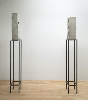
The first piece I am going to share is Two Loudspeakers by Isa Genzken (1986). The minimalist approach of two brutalist pieces. The simplicity of representation and the complexness of being intrigued. Duality has been an interesting phenomenon in the study of identities as well. I was particularly drawn by the fact that the two pieces of concrete and steel were slightly different. The piece on the left, for instance, has two instead of three holes and they are significantly smaller.
They are not two loudspeakers facing each other, but two pieces of concrete and an intent for representation. This piece is a clear reminder of how art can catalyze the start of a conversation. Or not. Genzken had a period where she produced pieces called “Basic Research” in 1989. These pieces looked like landscapes but were abstract oil paintings that reflected upon the idea of close-up impressions that translated micro to macro.
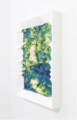
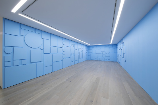
Another artist that exhibited in the Korean Cultural Centre is Seugwong Jung with the exhibition “Drifting Terrain”. At first, I was interested in the moiré effect generated by walking around the hanging fabric print piece. The idea of experiencing slight perceptual changes when walking around a piece was something taken into consideration in my first exhibition at UAL Dialogues, where spectators had to wear glasses in order to see the work. Of course, having to wear a device, and especially when it is not necessary to achieve an effect, helped me discard that display.
Seugwong Jung / Quarry &Digital Strata. Giclée print (2022)
However, it was when I dug deeper into the exhibition that I encountered a main potential intersection that particularly intrigued me. The idea of being able to code colour to generate textures using only the alphabet letters to assign values. This idea reminded me that I could use a similar software to achieve results using a previous birefringence chart. Sometimes by interconnecting the tools of two apparently dissimilar disciplines like physics and topology you can achieve interesting results.
The Korean Cultural Centre UK (KUCCUK) mentions in the Drifting Terrain brochure how a series or repeated gestures transform images through reconfiguration or a process of deconstruction. There is an interest around the passing of time, process wise, and an exploration of the relationship between human existence and the vastness of time/space. “The work embraces dualities and contradictions. She seeks to discover how two different layers can stand together and overlap each other rather than denying or removing one side”.
The idea of using perception to address sociopolitical subjects, also resonated with my work. By questioning space, temporality becomes part of the conversation by extension. In an interview held at Peckham 24, Jung commented on other aspects of her work that I was interested in. Because my notetaking was not sharp enough, I was left with the sloppy remains of what once was a good conversation:
Intersections — accumulation of pixels
Making images visible // time and space
Friction— layering enhanced experience
(“Strata” – textile pattern)
“The shape of the past”
The idea of layering:
“To reveal, you have to hide”
These ideas, although vague, resonate when thinking about my own piece, and how pixels, for instance, change their binary qualities to be translated to a specific material value where it occupies space. The pixel becomes a surface over which I can later assign any colour value by exploiting the phenomenon of its physical properties, opening questions about time and space. I like to think about it as a mirror with simultaneous gazes, all recollecting a different outcome from of the same immutable material at the same time.
Spiros Hadjidjanos, in his earlier work before Boite Verte –made in 2019–, also used the software CURA to convert 2D images to 3D models. I’m interested in how, in his more recent work, he has gained interest for earth surfaces and textures in the same way Seugwong Jung was driven to its representation possibilities. Material wise, I like Jung’s and Hadjidjanos’s work use soft surfaces to represent rough structures such as strata or a topologic map extract.
The use of colour, however, is very literal in Hadjidjanos’s work, so he uses blue to represent water, green for vegetation and a pale colour to represent more arid surfaces. The edges have been softened, so the model becomes more realistic. The frame is embedded in the structed, however, the colour is functional in delimiting the desired area to be repurposed. The frame contains the work, as well as providing a decorative aesthetic while protecting the central piece.
Another aspect I am interested in, and I would like to continue exploring, is perception study in the context of immersive pieces. Sarah Zhe has a history of building immersive structures that have a systemic appearance while at the same time including seemingly unrelated bits that build up the experience.
Zhe comments on the fact that there is a unique perspective, so the workpiece “appears” for the viewer. She also speaks about the human’s potential to create images in one’s head. These tangible representations show complex systems where some elements hover around it with no apparent resolution.
Sarah Zhe likes working in dark spaces, as she states it generates a predisposition of discovery in the audience. For the Fifth Season sculpture, she was inspired in the idea of latency, so she generated a piece based on the idea of brushstrokes in space. This particular piece, emulates the idea of landscapes as a concerning subject. The idea behind it is one of disorientation and reorientation in the natural-shifting relation between physical space and moment of meaning.
The artist also refers to the interior landscapes one can access through memories and imagination. According to her, images create space while sculptures take it. The idea of building sculptural fractal imagery presents a hybrid where space is presented as an unknown open to be explored.
This opulent maximalist immersive sculptures with bright colours lead me to this next artist, whose work I do not enjoy but that allowed me to be critical and try to understand why. Material wise, Austine Wood Comarow uses light polarization to craft her pieces. She uses a term she likes to call “Polage”, which referrers to doing collage work by using polarizing filters.
First of all, a characteristic I think differences my work from hers is the fact that I believe plastic polarization con lead to more powerful results than colour paper being polarized. Even though an interesting effect she accomplishes is the one where she reveals a secondary, hiden picture, I believe this generates an automatic contract that can distract from the nature of what is happening process wise.
By showing abstracted figurative images and not paper illustrations, I am allowed to explore the light possibilities hidden within a single object. Another important difference around my models and hers are that, in order to polarize the images, she introduced a linear polarizing filter cut in a circle with a stick in the middle so you can rotate it and see the work shifting.
External rotation allows a participatory individual interaction, however, by needing an external viewing device (such as I did in the Dialogues show) I believe it is harder to grasp the idea of the object being polarized. This happens when you are perceiving them as a composition made out of individual bits and not a single structural object that changes.
One I aspect I do like, however, is how the framing gives a sensation of cohesiveness in the piece. The lightbox is correctly hidden, however having to use “visualizer” reduces the scale in which you are able to perceive the full object by providing a version that will always be cut in the middle. Also, externalizing the polarization process when being able to integrate in the framing structure, is something I believe can have a higher impact.
Artists like Austine Wood-Comarow have themes and subjects I don’t connect with, and it is important for me to find a conceptual content that has more possibilities to question the audience, than to be decorative. This is why I am also struggling to find the correct print as I believe a tree, while providing good polarizing results, is not enough for me to address broader and more important subjects. Austine provides helpful graphs to understand the phenomena of both birefringence and photoelasticity that I will recollect for the research section.
Austine Wood Comarow/ “Polage”. To the right, her device to interact with the pieces.
Two other artists who I revisited for this unit are Jiro Takamatsu and Larry Bell with their pieces Cube of Perspective Nº249 (1969) and Glass Cube respectively. It is interesting to compare these two pieces even though there are substantial differences between them.
Tamakastu’s piece presents a smaller cube on top of the monochromatic plinth. It was a fake base that supports the top part, so it gives an effect that makes it look like it’s floating. The idea behind this piece it that it provides a fake angle so it reflects upon how a single perspective can get distorted as we walk around the space. We start realizing that a seemingly concave shape is laying on top in order to confuse us and present the question about how we experience the object’s disposition and the questions behind that particular design.
I find Larry Bell’s Untitled very similar to the final preview I did for my own work in my head, with the difference that a lightbox was going to illuminate the surface with an opaque white acrylic to diffuse the light. I thought the materials Bell worked with were polarizing filters, however it is made out of vacuum coated glass with a chrome plated metal framing – while Tamakastu’s is lacquer on wood.
I think both of their works raise important questions, coming from a perspective study or materiality explorations. The effects they generate on the audience is very different, however the figure of the plinth is a constant. Why? Taking into consideration how short the gap between both pieces is, one can imagine the artistic trends of the time, or otherwise question the universality of elevating an object to eye sight as a way of adding a seaming importance to the piece.
There is an ongoing exploration of the relation between light and space and the finish fetish. Larry Bell’s pieces also present smoked boxes that remind me of the constant of isochromacy as a question, more than a description of properties. By presenting layers of materials covered in the same mixture of colour and texture one can’t avoid but question where the image really is.
To the left Jiro Takamatsu / Cube of Perspective No 249 (1969). To the right Larry Bell / “Untitled” (1965)
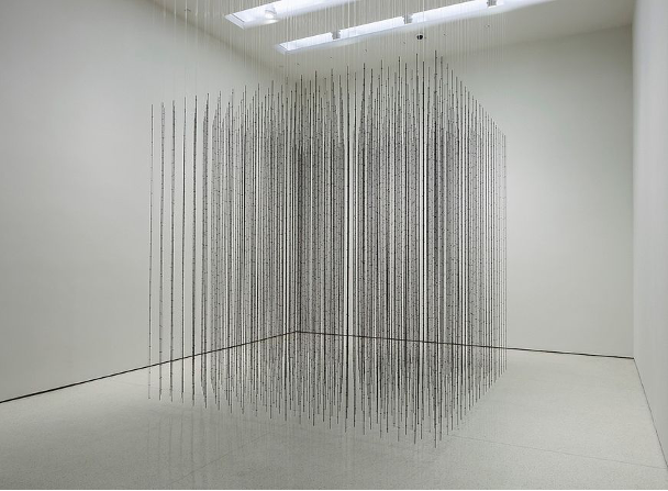
Mona Hatoum is another artist that plays with perception using principles of metal image completion. The floating cube is composed by hundreds of barbed wire rods dangling from fishing wire. The idea of repurposing objects to create others is something that I can directly relate to my practice. Maybe not by repurposing the shape of the material but by re-symbolizing materiality by hiding part of the structure. Hatoum’s fishing wire could find the equivalent (function wise) in the rotating structure of my device.
The angle exploration reminded me of how light bounces in all directions unless having a device to do otherwise (by directing, diffusing or polarizing it). There is not only linear or circular polarization but elliptical polarization as well. I think it is interesting how the light from Hatoum’s piece comes from the ceiling to avoid the shadows from distracting from the intended effect.
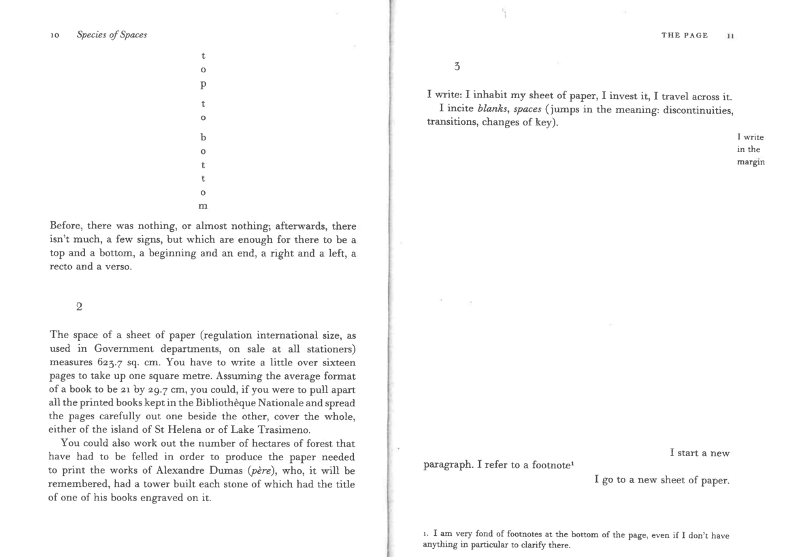
Another artist that inspired my research when I encountered him is Georges Perec. The fact that he is a writer and not a Fine Art artist speaks to me about the importance of crossed discipline practice. In his writing, he explores the limits and boundaries of space. Species of spaces explores the limit of space exploring the limits of its own media. The page becomes the surface holding the space exploration by occupying, crating and taking space by itself.
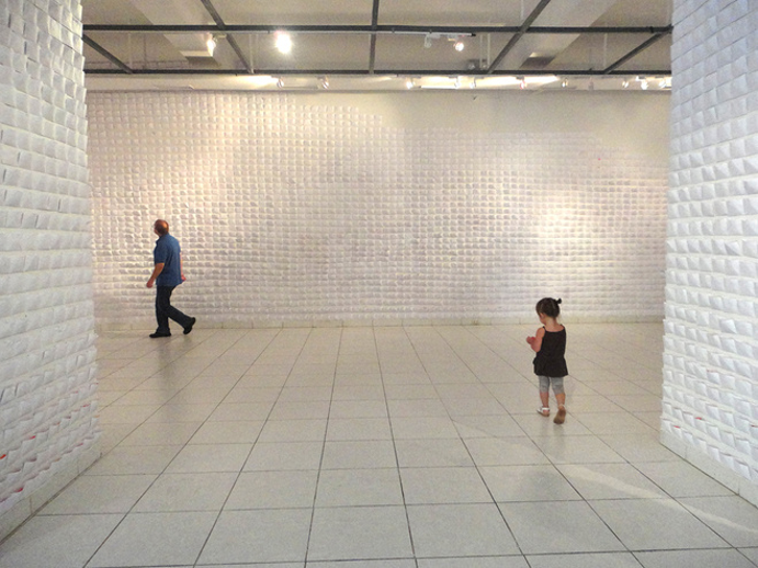
Natalia Villanueva is a Peruvian artist that does immersive installations using common materials. For an exhibition in Lima that was held in 2013, she put thirteen thousand white envelopes filled with neon confetti. As an spectator you would enter the white space, and it was once you got very close to the piece that you could see the colours when looking down. I remember I was interested in how one can exploit the physical properties of materials by positioning it in a certain way. The piece was activated when you took the decision to get closer, so the colours acted as a relief.
This piece showed me a lot about perspective, as well, since its simplicity generated something difficult to pinpoint at the time. I remember you could see some small bits that peaked out of the envelope. Those were hints that lead you to get closer. The shadows of the envelopes also hinted with them being full, so the half open packed envelope generated a sensation of latency, a need to find liberation or constraint.
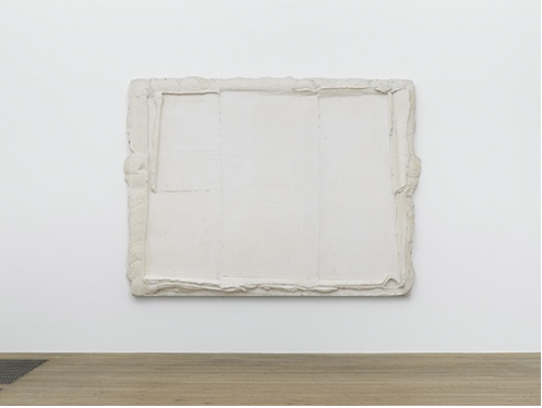
Ideally, I will be looking at an intermediate version between a single piece and a site specific one. Paintings like Bogart’s and other artists do single pieces exploring white paintings (there is a whole section of them at the Tate Modern). Bogart’s painting ‘White lane white’, is not really white. We can also see the yellowish tone that the passing of time prints on top, as well as the different shadows created by the texture. The process is generally shown and not hidden, by revealing how the paint was spread, and how the strokes were most probably made with a large surface, similar to a flat spatula.
This pictorial piece presents the process embedded in the final piece. There is no intent of making the brush strokes perfect, however we are able to perceive it as a single unit, separating it from the background. The question of where the image is remains unsolved, leading to a space where the satisfaction of the piece relies in the questions it possesses rather than in what it is actually showing. The frame doesn’t really exist, it is an illusion.
The curation by Kenny Schachter in 2013 balanced the retrospective work of Paul Thek, a multidisciplinary artist that never got much recognition. The curatorial display allows to see the work without it competing with itself. It allows every piece to breathe while respecting the nature of each media. This is Tomorrow’s review of the work said: “Nothing but Time can suggest a metaphysical expanse, a death sentence, or both.”
I believe the coexistence of different media, although usually separated, can lead to interesting conversations. For instance, the chair Schachter put under the paintings doesn’t distract the viewer, it is an invitation for contemplation while speaking about the passing of time. Sitting down, facing at a single perspective, chosen for you.
So, stacking, accumulating before separating or eliminating appear as recurrent subjects, as well as the passing of time and perception. Claude Rutault, for instance, stacked shapes creating monochromatic layers that spread around the room. The monochromatic structures covered only certain areas generating cluster of works on the different walls of the space available.
Rutalt’s death, reminded me of a commercial piece I saw at the Affordable Art Fair. It had the texture of toothpaste coming out of the circular frame. As soon as you got close, you recognized the accumulation of dust over the whole structure. Pieces like Claude Rutalt’s, I believe, create cavities for time to accumulate. It is inevitable. In spite of how long lasting an artwork can be, as artists we can decide to protect certain pieces. Which reminds me that art should be made to be seen, not hidden or stored. However, is it relevant to question land scarcity or curatorial paternalism?
These unlimited ideas, seemingly uncorrelated circulate around the idea of thresholds, the idea of the audience engaging with the piece to make it work. Pieces like Etant donnes by Marcel Duchamp require that the audience approach the piece to peep and have access to what is being shown inside. The piece is made out of the intervention of three spaces, the before the in-between and the after. It plays with the idea of un-seeing.
Duchamp also hides the piece, unless the spectator engages actively with it. You have to see through, to access one unique, biased perception. I intend to show, therefore, how single perspectives can present ramifications. Or propose the question of how we could show the branching out of plural singularities. I believe the filters are working like a peephole, allowing access to multiple versions of a single display.
Marcel Duchamp / Etant donnes 1946 – 1966
The final artist I will talk about in this segment is Levi van Veluw. This artist is interested in how people activate icons with their own energy. Taking inspiration from clocks and his grandfather, who was a pastor. His work reminds me of mine. He was obsessed with constructing and de-constructing old clocks. He was, however, not a believer, but believed in another type of spirituality, more related to human kindness and acceptance.
Van Veluw’s kinetic sculptures connected with my work not only in the search of kinetic structures, but on an emotional level, by translating or dragging his own experience to pieces with universal subjects. I believe you can intend to induce certain emotions with a piece; however, it won’t necessarily evoke that in every viewer. Kinetic pieces have to be loaded with energy to function, the mechanism functions as a form of relief by release.
There is a clear intent for not accepting a single perspective, but to recreate the coexistence of multiple realities with artifacts that evoke them. In the way a single piece is open to interpretations, it also becomes the deposit and the evoker of this multiple inputs. By giving movement to a piece, you allow it to present you with other versions that shift making use of time.
Levi van Veluw – Symbols of persuasion (2022)
CONTEXTS BIBLIOGRAPHY
Art, P. M. of. (n.d.). Marcel Duchamp: étant Donnés. Philadelphia Museum of Art. Retrieved June 1, 2022, from https://www.philamuseum.org/exhibitions/324.html?page=2
Austine Wood Comarow. (n.d.). The physics of Polage Art. Austine Studios. Retrieved May 30, 2022, from https://www.austine.com/physics
Dandelion & Burdock. (2013, October 4). Nothing but time: Paul Thek revisited 1964-1987. Nothing But Time: Paul Thek Revisited 1964-1987. Retrieved May 31, 2022, from http://thisistomorrow.info/articles/nothing-but-time-paul-thek-revisited-1964-1987
Drifting Terrain | KCCUK. (2022). Retrieved 30 May 2022, from https://kccuk.org.uk/en/programmes/other-exhibition/drifting-terrain/
Natalia Villanueva Linares. Write Spirit LA. (n.d.). Retrieved May 31, 2022, from https://nati.work/write-spirit-la
Perrotin. (2019, June 8). Exhibition: Claude Rutault, ‘de-finitions/methods from the 70s’ at Perrotin, New York, USA. Ocula. Retrieved June 1, 2022, from https://ocula.com/art-galleries/perrotin/exhibitions/de-finitionsmethods-from-the-70s/
Sarah Sze. (2022). Retrieved 30 May 2022, from https://collections.stormking.org/Detail/objects/7570
Spiros Hadjidjanos – info@spiroshadjidjanos.net. (2022). Retrieved 30 May 2022, from http://spiroshadjidjanos.net/
Stephen Friedman. (n.d.). Jiro Takamatsu, Cube of Perspective No.249, 1969. Stephen Friedman Gallery. Retrieved May 31, 2022, from https://www.stephenfriedman.com/artists/55-jiro-takamatsu/works/12713/
Symbols of persuasion – Symbols of persuasion. gallery rosenfeld. (n.d.). Retrieved June 1, 2022, from https://galleryrosenfeld.com/exhibitions/current/
Tate. (2022). Retrieved 30 May 2022, from https://www.tate.org.uk/art/artworks/genzken-two-loudspeakers-t13220
Tate. (1974, January 1). ‘white plane white’, Bram Bogart, 1974. Tate. Retrieved May 31, 2022, from https://www.tate.org.uk/art/artworks/bogart-white-plane-white-t14202
The Guggenheim Museums. (n.d.). Mona Hatoum, Impenetrable. The Guggenheim Museums and Foundation. Retrieved May 31, 2022, from https://www.guggenheim.org/artwork/30304
Untitled, 1965 by Larry Bell, vacuum coated glass, 45.7 x 45.7 x 45.7 cm. Ocula. (n.d.). Retrieved May 31, 2022, from https://ocula.com/art-galleries/hauser-wirth/artworks/larry-bell/untitled-(2)/